bpw

Monday, March 12, 2012

Reclaim the Frame


Going through some closets and cabinets in my parents home that have not been opened in a long time, I found 4 frames that had images of fruit in the middle.  The frames have a nice vertical stretch orientation and satisfy my desire to illustrate some thoughts.  After taking a Dremel like tool and sandpaper then paint, I've put some images down and proceeded to take some quick digital shots on my rather anti-professional t-shirt backdrop.  The images are blurry and the colors are off, but like everything I post, some day when they are done, I will take proper photos and then post.

Titled: Remorse

Titled: Dunce Control

Thursday, March 1, 2012

New-ish wall piece and painting...


I've been experimenting with different skin tones color blends trying to find what I want for the longest time, and sorta stumbled across one that is quite close to what I envision.  The little guy is a wall piece and is supposed to be in forced 3Dimensional perspective to simulate illusionary depth though it exists in real space.  This is an idea I need to explore more, but its a neat little start.  He is about 5x12 inches and is titled:  I can't fall fast enough.  The skin tone and top coat looks pretty good in person, but as great in a quick digital still for this blog...


I also decided to make a newer painting that basically steals from my postcards.  Its 10x12 inches and is in version 3.5 of probably 5 before I'll consider it complete.  It reads and is titled, heartachers have been lurking in the shadows of ghosts.  I think it's rather dirty/messy still and needs cleaned up, and the two hands need depth and softened but whatevs. 


Monday, February 13, 2012

Happy Valentime's Day!


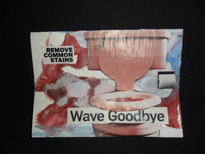
I was happy to have some of my new series of postcards up for view just in time as Valentime's Day approached.  I don't believe they were as effective or affective as anticipated.
This new series should be 20 cards in total and is titled: Postcards I'll Never Send (PINS).  I think the title is rather appropriate since they are cards meant for a lost love.  Like the first series: Hopeless Romantic, they are created through the grieving process so to speak.  They are suppose to be the statement of apology and sadness through the contrived efforts and slowest form of interaction.  I would hope that people would view these postcards and fill out the other side, address it, put a stamp on it, reread it a few times and wonder if they wrote enough and then get this twisted-knot warmish feeling in their chest coupled with a crunching and crushing rigor of reality that tells them that it's hopeless.  Then you will know how I feel, and I've done my job.
I am still in the early stages of this series and plan on spending many more hours on the cards before they are done.  Even the Hopeless Romantic cards still need work! The glare from the camera is not ideal and neither is the warping from the mat medium that I used last night, but ohhh well.  They will be flat and neato when I'm done.  I still really dislike many of them but it's understandable since they are so early in the process, but I wanted to get something online in time.  Plus they can't all be winners and likely won't be... :/
The above spelling is intentional and purposeful...
(Click on the images for a larger view)


Brian P. Weaver. Copyright 2011 All Rights Reserved